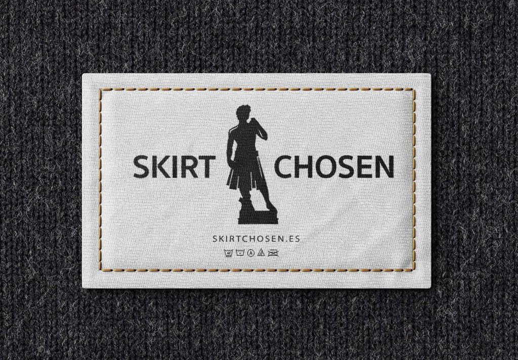
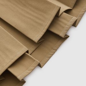
SKIRTCHOSEN is a clothing brand specialized in men’s skirts and unisex accessories.
Challenge
Design a catalog for mobile devices, with a defined and attractive identity.
Inform in a practical and interactive way the products of each season, grouped by collections and genre.
Include the maximum information of the products in a condensed form (colors, materials, etc).
Process
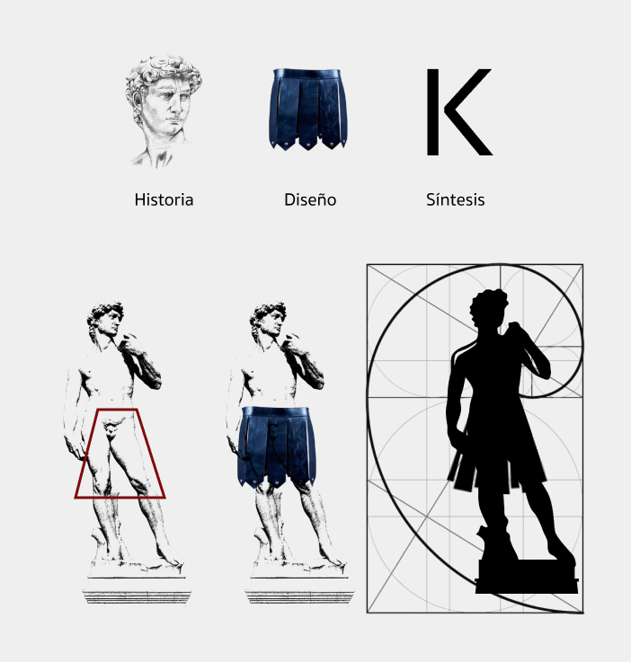
Research and documentation on the importance and significance of the skirt in men’s clothing throughout history.
Design and elaboration of sketches and versions
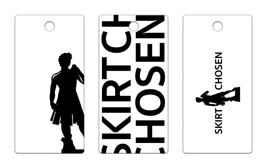
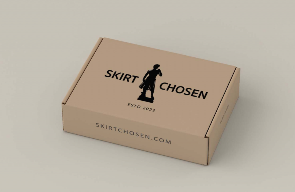
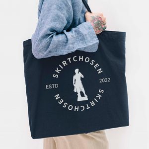
Adaptation to different formats and colors for implementation in labels, packaging and logos.
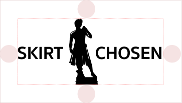
Logotipo
">">Isotipo
">">Isologo
The outcome
It has been achieved a logo that represents history and modernity using the silhouette of Michelangelo’s David as the most representative form. A recognizable figure that by giving it a twist creates an unique and distinctive isotype. The brand acquires notoriety and representativeness along with scalability and simplicity, making it an attractive design for the public with a direct and concrete message.